
- Build Mobile-Friendly Websites for Real Clients
- Learn Responsive Design for All Devices
- Work with HTML, CSS & jQuery Step-by-Step
- Create Websites That Adapt to Any Screen Size
- Learn jQuery Mobile for Interactive UI Design
- Build Real Projects During Training
- Start Freelancing as a Frontend Developer
- High-Demand Skill for Web Development Jobs
Responsive Web Design With J query Mobile Course

🎯 Learn Responsive Web Design & Start Building Mobile-Friendly Websites
Live Online Training to Create Responsive Websites Using HTML, CSS & jQuery – Start Your Web Development Career
COURSE DESCRIPTION
What Is the Responsive Web Design with jQuery Mobile Course?
Most people now reach a website from a phone, and a layout built for a desktop screen falls apart on one. Text shrinks to nothing, buttons sit too close together, and half the page needs pinching and dragging before it can be read.
Looking for a responsive web design course near you? Ours runs live and online, so you join at your batch time, build the layout along with your trainer, and see it tested on different screen sizes in the same session.
In this course you build sites that work on a phone, a tablet and a desktop from one set of code. You cover viewports, CSS3 media queries, breakpoints, fluid grids, flexible images and responsive navigation, then test the result in browser tools and simulators. You also learn to use JQuery Mobile widgets, configuring JQuery Mobile defaults and page transitions, and to integrate web services with a mobile site, including working with Google maps, RSS feeds.
In the final week you will customise ThemeRoller for JQuery mobile to download existing or custom themes to format the appearance of a website professionally.
LiveTrainingLab Responsive Design Course Goals
Clients now judge a site on a phone before they ever open it on a laptop, and a layout that breaks on mobile costs them enquiries. That is why responsive work is one of the steadiest jobs in front-end development. If you are thinking about joining our responsive design and jQuery Mobile course and are unsure what it covers or whether it suits your level, here is a short walk through the 4 weeks.
Build a Real Responsive Design Foundation
Build a Real Responsive Design Foundation to build a strong foundation in the programming and syntax Responsive web designing and JQuery language In English, Urdu or Hindi. Get a series of practically excited and focused challenges to get professionally confidence at our live training platform anywhere, on your schedule.
Get Your Certificate After the 4 Weeks
You finish with a LiveTrainingLab certificate for the responsive design and jQuery Mobile course, issued once the 4 weeks and the final project are complete. The site you build in class is what a client will actually ask to see.
A responsive site you can show a client
Practice files from every live session
A final project to prove what you learned
Where Responsive Design Skills Get Used
Making an existing site work properly on phones is one of the most common jobs handed to a freelancer, because so many older sites were never built for it. Landing pages, business sites and small e-commerce fronts all need it. By the end of 4 weeks you can take that work on yourself.
What You Will Learn in These Live Classes
- Designing and building a responsive Website
- Setting the viewport of a Website
- Writing CSS3 media queries
- Scaling images and media
- Creating responsive navigation and layouts
- Using both CSS and jQuery to create tables that are responsive
- Creating a jQuery Mobile page using the single page and multi page templates
- Configuring fixed and full-screen toolbar
- Configuring a custom theme using Themeroller for jQuery Mobile
- Configuring jQuery Mobile using the mobileinit event and the $.mobile object
- Using layout grids to format page content
- Using the Panel widget to display a panel on a page
- Creating collapsible content blocks using the Collapsible and Collapsibleset widgets
- Building reflow and column-toggle tables using the Table widget
- Building a responsive form using jQuery Mobile widgets
- Providing filter capability to a page using the Filterable widget
- Integrating jQuery Mobile with Web Services
How Our Live Responsive Design Classes Work
Every session is taught live by a trainer at a fixed time, with a small batch. You have your editor and browser open and you build the layout along with the class, then drag the window narrow and watch what breaks. Share your screen and the trainer can see why your grid is overflowing or why a media query is being ignored.
Questions get answered as they come up, in English or Urdu. Each class ends with a build task, and the next one opens by reviewing what you produced. Over 4 weeks that leaves you with a site that genuinely works on a phone rather than notes about one.
Why a Live Class Beats Following Responsive Tutorials
Responsive design looks simple until your own layout collapses at an awkward width. Tutorials always demonstrate on a tidy example page, and yours is never that. The gap between the two is where most self-taught attempts stall.
A trainer looking at your actual code spots the cause in a minute, whether it is a fixed width you forgot, a missing viewport tag or a breakpoint set in the wrong place. You also learn to use the browser device tools properly, which is what makes you self-sufficient afterwards.
Course Schedule
| Start Date | Time | Seats Left | Price | |
|---|---|---|---|---|
| 07-Oct-26 : Wed | 10:00 AM | 5 | 15999 Rs | Register Now |
| 08-Oct-26 : Thu | 12:00 PM | 1 | 15999 Rs | Register Now |
| 09-Oct-26 : Fri | 02:00 PM | 1 | 15999 Rs | Register Now |
| 10-Oct-26 : Sat | 04:00 PM | 4 | 15999 Rs | Register Now |
| 12-Oct-26 : Mon | 08:00 PM | 3 | 15999 Rs | Register Now |
| 13-Oct-26 : Tue | 10:00 PM | 1 | 15999 Rs | Register Now |
| 14-Oct-26 : Wed | 06:00 PM | 4 | 15999 Rs | Register Now |
We provides this course in following city of Pakistan
- Karachi
- Islamabad
- Rawalpindi
- Azad Kashmir
- Lahore
- Sialkot
- Gujranwala
- Multan
- Gujrat
- Faisalabad
- Sahiwal
and other major cities in Pakistan.


100% online courses
Start instantly and learn at your own schedule.

Flexible Schedule
Set and maintain flexible deadlines.

Learn the latest skills
with on-demand training and development programs

Shareable certificate
Earn a Certificate upon completion
Shareable on Social Media
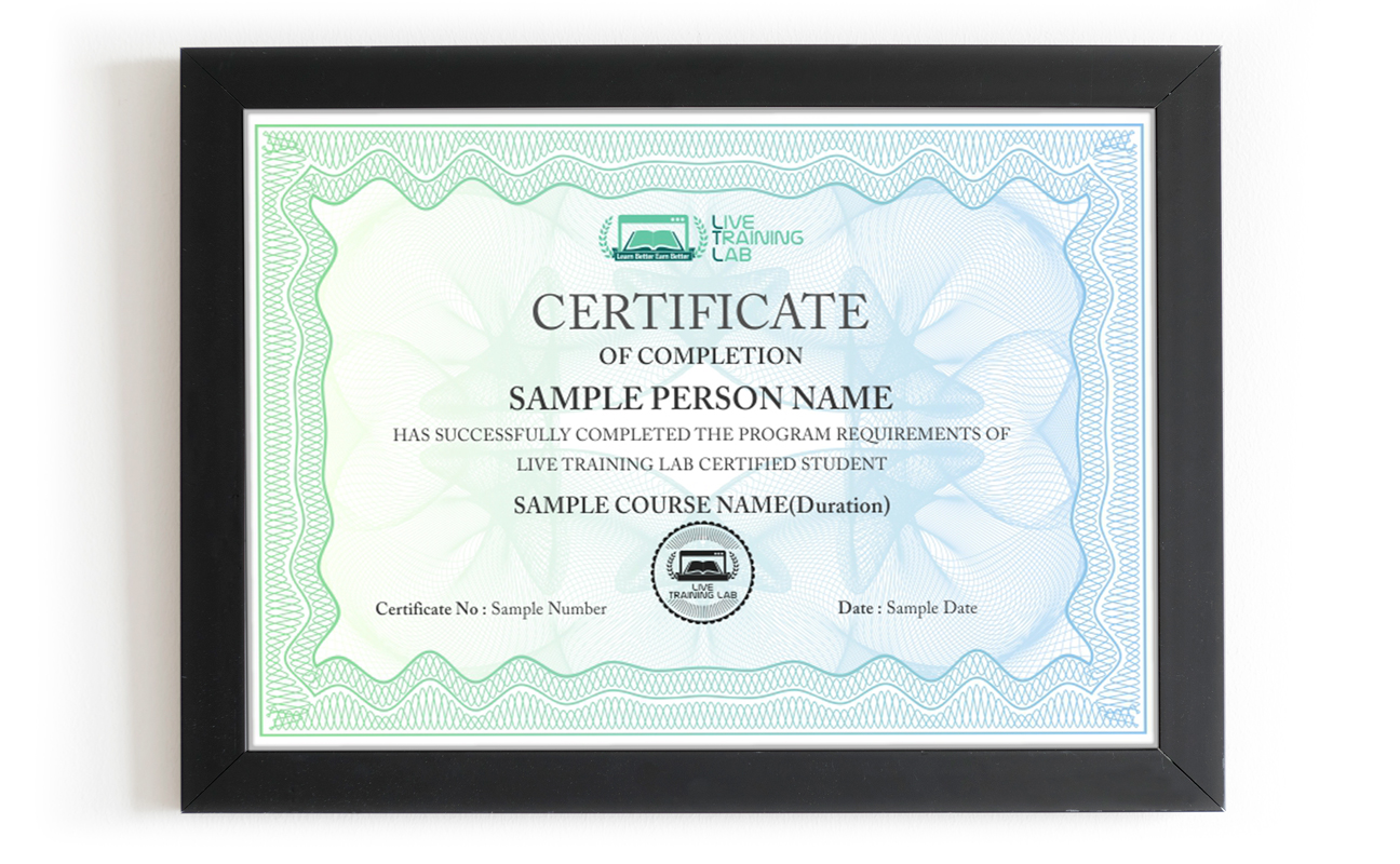
You can share your Certificate in the Certifications section of your social profile, on printed resumes, CVs, or other documents.
CURRICULUM
- What is the Mobile Web?
- Defining Responsive Design
- Responsive Web Design (RWD) Principles
- Responsive Layout vs. Adaptive Layout
- Designing for Mobile First
- Progressive Enhancement
- Fluid Grid Layouts
- Creating Flexible Images and Video
- Optimizing Images for Retina Displays
- Responsive Typography
- Responsive Navigation Patterns
- Designing Responsive Tables
- Creating a Responsive HTML5 Page
- Explanation of Themes and Swatches
- Using the data-theme Attribute
- Overview of jQuery Mobile Intrinsic Classes
- Using ThemeRoller for jQuery Mobile
- Adding Specialized Hyperlinks
- Integrating with Web Services
- Making Ajax Requests
- Displaying XML Content
- Displaying JSON Content
- Working with Multimedia
- Organizing Content with Grids
- Testing Layouts Across Screen Sizes
- Adding Headers and Footers
- Positioning Toolbars
- Auto-Generated and Customized Back Buttons
- Adding Content to Toolbars
- Using the Navbar Widget
- Persisting Toolbars Across Pages
- jQuery Mobile Form Requirements
- Form Auto-Enhancements
- Creating Accessible Forms
- Defining Field Containers
- Grouping Controls with the Controlgroup Widget
- Adding Input Fields
- Working with Select Menus
- Using a Slider for Numeric Input
- Selecting a Range of Values with Rangeslider
- Creating a “Flip” Switch
- Registering Event Handlers
- Comparison of ready and pagecreate Events
- Introduction to Page Events
- The mobileinit Event
- Registering Events in jQuery Mobile
- The Popup Widget
- Positioning Popups
- Dismissing a Popup
- Adding a Close Button
- Modal Popups
- Using Popups for Tooltips
- Embedding Content in Popups
- Theming Popups
- Using Popups for Navigation
- Displaying Popup Transitions
- Reusing Popups on Multiple Pages
- Dialog Overview
- Customizing a Dialog
- Linking to the Dialog
- Chaining Dialogs Together
- Displaying Dialog Transitions
- Using the Table Widget
- Overriding CSS Classes
- Reflow Table Mode
- Column-Toggle Table Mode
- Using the Filterable Widget
- Defining a Search Field
- Using “Reveal”
- Using a Remote Data Source
- Filtering on Alternative Text
- Controlling Filterable Items
- Defining a Custom Filter Function
- Working with Viewports
- CSS3 Media Queries
- Determining Breakpoints
- Installing and Using Viewport Testing Tools
- What is jQuery Mobile?
- Configuring and Downloading the Mobile Library
- jQuery Mobile File Structure
- Working with HTML5 data- Attributes
- jQuery Mobile Page Structure
- Overview of the Page and Pagecontainer Widgets
- Using Single-Page vs. Multi-Page Templates
- Prefetching Pages
- Caching Pages in the DOM
- Configuring the Loader Widget
- Navigating Between Pages
- Displaying Pages as Dialogs
- Examining the Widget Factory
- Configuring Widget Options using JavaScript
- Using the data-role Attribute to Create a Widget
- Creating Lists with List Views
- Creating Numbered Lists
- Creating Inset and Non-Inset Lists
- Formatting List Content
- Working with Nested Lists
- Defining a Filterable List
- Creating Buttons
- Defining Inline Buttons
- Creating Button Groups
- Configuring Buttons with Attributes and CSS Classes
- Formatting Buttons
- Theming Buttons
- Configuring Default Settings Using the $.mobile Object
- Storing and Removing Arbitrary Data
- Loading and Changing Page Content Dynamically
- Using the Panel Widget
- Setting a Panel’s Position
- Setting the Display Mode
- Opening and Closing Panels
- Creating the Open Button
- Controlling Close Behavior
- Making Panels Responsive
- Reusing a Panel on Multiple Pages
- Updating a Panel Dynamically
- Creating Content Panels
- Defining the Tabs
- Configuring the Tabs Widget
- Using the Collapsible Widget
- Controlling a Collapsible’s Appearance
- Opening a Collapsible by Default
- Nesting Collapsibles
- Opening/Closing Programmatically
- Creating Groups of Collapsibles
- Working with RSS Feeds
- Google Maps Integration
- Server-Side Data Access
Creating Responsive Grids
Batches, Timings and the 4-Week Plan
The course runs over 4 weeks and follows the curriculum above. Week one covers the mobile web, responsive principles, mobile-first design, viewports, CSS3 media queries and breakpoints. Week two is fluid grids, flexible images and video, responsive typography, navigation patterns and tables. Week three introduces jQuery Mobile: page structure, data attributes, single and multi-page templates, toolbars, list views and buttons. Week four covers forms, popups and dialogs, panels, tabs and collapsibles, themes with ThemeRoller, Ajax and web services, plus the final project.
Batches run morning and evening so students and working people can both find a slot. Your timing is confirmed at enrolment, and the trainer stays reachable through the course.
Who This Responsive Web Design Course Is For
Front-end learners who can build a page but not one that survives a phone. Freelancers asked to make an existing site mobile-friendly. Designers who want to build their own layouts rather than hand them over. Small business owners whose site loses visitors on mobile. WordPress users editing themes that were never properly responsive.
Basic HTML and CSS is the one thing worth having before you start, since most responsive work is CSS. JavaScript is not required. Mention your level at enrolment and the early sessions will be pitched accordingly.
jQuery Mobile is a framework of ready-made mobile interface pieces: pages, toolbars, list views, buttons, popups and forms that already behave properly on a touch screen. It saves you writing that layer by hand, and at LiveTrainingLab you build with it in every live session.
A lot of existing sites still run on it and still need maintaining, so the skill has value. More importantly, the responsive principles taught alongside it, viewports, media queries, breakpoints and fluid layouts, apply to any tool you use afterwards.
Basic HTML and CSS helps a great deal, since responsive work is mostly CSS. You do not need JavaScript to start. Tell your trainer what you already know at enrolment and the early sessions will cover the gaps.
The LiveTrainingLab course runs over 4 weeks of live classes, which is enough to build a responsive site and a jQuery Mobile interface from scratch. You keep the practice files afterwards so you can carry on building.
For mobile-first interfaces, yes, and the course covers enough HTML5 and CSS3 alongside it to build a complete site. Anything heavier usually wants a back end too, which is where a PHP or JavaScript course picks up.
Language stops a lot of capable people from getting far with front-end work. The eye for layout is there, the English is not, and the class moves too quickly to follow. So our trainers teach the responsive design and jQuery Mobile course in English or Urdu, switching between the two mid-session when it helps someone follow. Batch timings are set when you enrol, and the course runs over 4 weeks.
Fixing a site that breaks on phones is one of the most common small jobs on freelance platforms, and it is work you can do remotely for clients anywhere. Your trainer will also show you how to present the before and after, which is what wins those jobs.
The concepts are not hard, but the first responsive layout usually fights back. That is exactly the point where a live trainer looking at your screen saves you days, and it is why the course is taught live rather than sold as videos.
We want solid responsive design skills to stay within reach of students and working people, not priced like a corporate bootcamp. Every student gets the same attention from the trainer, whichever batch they sit in. Ask us about current fee options when you enquire, and we will tell you what the 4-week course costs before you commit to anything.
No. The responsive side is almost entirely HTML and CSS, and the jQuery Mobile widgets are configured mainly through data attributes rather than code. Some basic JavaScript helps in the last week, and your trainer will cover what you need as it comes up.
A laptop or desktop, a steady internet connection and a headset. Classes run on Zoom, so the app or a browser is enough to join. A phone beside you is useful for checking your layouts on a real screen, and your trainer will show you the browser device tools in the first session.
About Instructor

Zohaib Baig
Before engineering, I developed and implemented CI (Continuous Improvement) management systems in companies across America in various industries to include a military finance organization.
₨32,000.00₨16,000.00